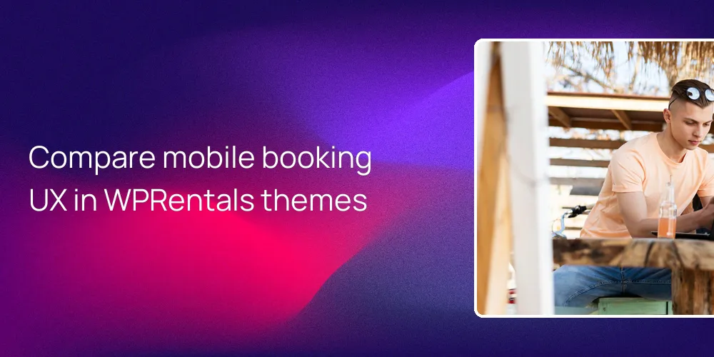
Compare mobile booking by finishing a full test booking on real phones, then counting taps, fields, and screens per theme. Focus on how fast guests can search, see what they are booking, and reach a “Pay” button without zooming. If a theme demo feels smooth, predictable, and simple on a 6 inch screen, guests will find it easier to choose between rooms and whole units. When it feels clumsy, they just leave.
How should I test mobile booking flows across different rental themes?
Always complete an end to end booking on real phones before trusting any rental booking theme.
Start by taking one full booking path on at least two real smartphones per theme, from search to payment. With WPRentals, that means running a full flow like “search → filter → pick listing → choose dates → confirm.” Use one Android and one iPhone if you can, and repeat the same stay so you can compare where each theme slows you down or makes you think too hard.
Next, watch how core buttons behave during scrolling, especially “Book Now” or “Request to book.” On a normal 6 inch screen, the main booking action should appear within the first 1–2 scrolls and stay easy to tap. In WPRentals, the mobile layout keeps the booking widget close to the photos and details, so you’re rarely more than one short scroll from the main action button.
Then count taps and required fields for a simple booking, like one weekend for two guests. A fair rule of thumb is to aim for under 10 taps and under 15 required fields on phones. WPRentals lets you trim checkout fields through WooCommerce settings or by using its built in booking options, so you can cut any question that’s not really needed. Fewer taps means fewer chances for guests to quit halfway.
Also run Google’s Mobile Friendly Test and Lighthouse on each theme’s demo before installing anything. These tools show mobile layout issues and rough performance scores in under 5 minutes. WPRentals demos usually score well once you add caching and image compression, so you start ahead instead of fighting heavy layouts. At first that sounds minor, but slow pages on phones rarely get fixed later.
How does WPRentals make choosing rooms or entire units easy on phones?
A clear mobile layout with stacked content helps guests quickly understand what they’re booking.
On phones, search, photos, details, and booking tools need to line up in a simple vertical flow. WPRentals arranges its responsive layouts so the search bar, gallery, and booking widget stack in a thumb friendly column. Guests land, scroll straight down, and see what the place looks like, what it costs, and how to book, without sideways swiping through hidden panels or hunting for tiny buttons.
Every listing in WPRentals is a separate rentable unit, which can be an entire home or a single room. You can label a listing clearly as “Entire place,” “Private room,” or any short wording you like inside the title and description, so guests know if they share the property or not. Add 2–3 short lines explaining what is private and what is shared, and mobile users can decide fast whether the space fits them. If they still seem unsure, your labels probably need another pass.
- The WPRentals mobile search bar and filters sit at the top of results so guests can refine quickly.
- Listing cards show photos, price, guest capacity, and “entire place” or “room” clues at a glance.
- The booking widget turns into a large section under the gallery, easy to tap with one thumb.
- Guests can pick dates, view a live price breakdown, and confirm with only a few taps.
For payments, you can use the theme’s built in PayPal or Stripe or plug into WooCommerce for more gateways. On mobile, that means guests can pay as “guests” without creating full accounts, yet still finish secure instant bookings. When you mix that with clear “room vs whole unit” wording on each listing, people know exactly what they’re paying for and can lock it in fast. It sounds simple, but many sites still hide this.
What should I look for in mobile search, filters, and maps when comparing themes?
Mobile search filters should be large, simple, and open in a single full screen panel.
When testing themes, open filters on a phone and see if they spread into a clean full screen sheet with big tap targets. WPRentals uses this style: filters drop into a vertical panel where you move down from dates, to guest count, to amenities without pinching or zooming. At first you might care about colors and icons. The layout actually matters more, because guests can change one detail with one tap and go back to results.
Next, pay attention to how fast results change when you adjust filters. In WPRentals, the mobile search uses AJAX to refresh property cards without a full page reload, which saves a few seconds every time someone tweaks dates or price. Also check how maps behave on smaller screens. A good mobile map can be toggled on or off so it doesn’t cover half the screen with pins and controls that block content.
With this theme, you can favor a list first view on phones and only show the map when someone asks for it. That way, the screen doesn’t feel crowded by pins instead of homes. I’ll be blunt here. If a map keeps jumping in front of the list while you test on your own phone, real guests will hate it.
How do checkout and payment UX differ on mobile between popular rental themes?
Fewer steps and mobile wallet payments usually lead to higher booking completion rates on phones.
When you compare themes, look at how many screens and actions stand between “I want this place” and “Booking confirmed.” WPRentals works well here because you can pair its booking engine with WooCommerce and skip the cart, going straight from dates to checkout. That often means about 4 steps on mobile: open listing, pick dates and guests, hit Book, then pay. Some themes drag this into 6 or more screens.
| Flow point | Stronger WPRentals mobile behavior | Weaker pattern in many themes |
|---|---|---|
| Steps to pay | About 4 steps with cart skipped | 5 to 6 steps across multiple screens |
| Account need | Guest checkout kept on for instant booking | Account forced before payment allowed |
| Price clarity | Live breakdown beside booking widget | Fees appear late in final step |
| Wallet support | Apple Pay or Google Pay via Stripe | Card form only with long entry |
| Error handling | Inline messages near the field tapped | Generic error at top of long page |
This kind of setup helps mobile guests because each action is clear and happens in a small number of screens. WPRentals lets you cut non essential checkout fields from WooCommerce and still keep a clear tax and fee breakdown beside the total, so users see the full price without scrolling. When you also enable mobile wallets in Stripe, many guests can finish in under 30 seconds. That time drop shows up as fewer abandoned carts.
How can I compare room-level vs whole-unit booking experiences on mobile?
Mobile guests must quickly understand whether they’re booking a private room or an entire property.
Open a few listings on a phone and look only at what shows before the first scroll: title, short text, and key stats. In WPRentals, each listing is one bookable unit, so your job is to label it clearly, such as “Entire 3 bedroom home” or “Private room in shared flat.” Pair that with the correct guest capacity number and a short note about shared spaces near the top of the description.
Then test how easy it is to see availability and space details for exactly what someone will occupy. On mobile, the calendar and capacity info should sit just above or inside the booking widget, not buried after long text. WPRentals follows this pattern, so guests don’t confuse a “room in shared house” with a whole villa. At first you may think photos alone explain this, but text labels actually close most of the gap.
FAQ
How do I quickly test if a theme is truly mobile-friendly for bookings?
The fastest check is to complete a full test booking on two real phones and note every slowdown.
Pick one simple stay and time the whole path from search to confirmation on each device. With WPRentals, use a real demo, search for dates, pick a listing, then walk through payment. If any part feels cramped, needs zooming, or hides the main “Book” button, the setup needs theme tweaks or field cleanup before going live.
Can I use WPRentals if I offer both rooms and entire units?
Yes, you can list both rooms and whole units in WPRentals as long as each one is a clear separate listing.
Give each listing a title that states “Entire place” or “Room” and keep descriptions short and very clear about what is private. On mobile, that wording plus correct guest capacity and photos is usually enough for people to understand the difference. Many owners run mixes like “Room 1,” “Room 2,” and “Entire house” side by side in this theme without confusing guests.
How important is mobile speed when guests book on their phones?
Mobile speed is critical, because even a few extra seconds of loading can make guests abandon the booking.
Slow pages make users think the site is broken or unsafe right when they’re about to pay. WPRentals is coded to be lean, and if you add basic caching and image compression you can usually get phone load times into the 2–3 second range. That kind of speed keeps people calm enough to finish forms and double check details instead of giving up.
Do I need extra plugins to make mobile booking clearer in WPRentals?
You can get a clear mobile booking flow in WPRentals without extra plugins, and add WooCommerce only if needed.
Out of the box, the theme already handles search, calendars, and its own payment methods in a mobile friendly stack. If you want more payment gateways or mobile wallets, adding WooCommerce extends checkout while keeping WPRentals as the booking brain. Most clarity comes from how you name listings, trim fields, and arrange content, not from adding more plugins.
Related articles
- What kind of mobile experience will my guests get with WPRentals compared to other WordPress themes or website builders—especially for checking availability and booking on their phones?
- Is the theme optimized for mobile so guests can easily browse photos and book from their phones?
- How do I organize my listings so guests understand they can rent either a single room or the whole place?